Dark mode is a UI color scheme that renders light-colored text, icons, and UI elements on a dark background. Browsers detect the operating system’s active color scheme through the prefers-color-scheme CSS media query and expose it to stylesheets without any JavaScript.
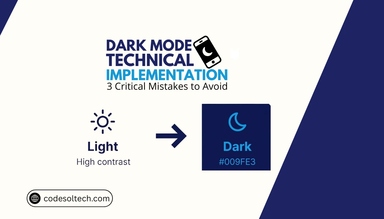
A correct dark mode implementation requires three coordinated layers: a CSS variable token system, a system-preference detection mechanism, and a persistent user-preference override stored in localStorage.
What Is Dark Mode in Web Development?
Dark mode in web development is the programmatic replacement of a page’s foreground and background color tokens so that luminance contrast inverts from the default light theme. The W3C defines two formal values for the prefers-color-scheme media feature: light and dark.

Operating systems — including Windows 11, macOS Ventura, Android 10+, and iOS 13+ — broadcast the active scheme at the system level, and browsers relay that signal to CSS.
Dark mode reduces OLED screen power consumption by up to 63 % at maximum brightness, according to Google’s 2018 Android study (ACM MobiSys). Web developers implement dark mode to improve battery efficiency on mobile devices, reduce eye strain in low-light environments, and satisfy the growing user expectation that all digital interfaces respect system-level theme preferences.
CSS Variables: The Structural Foundation of Dark Mode
CSS custom properties (CSS variables) are the only scalable mechanism for theming a large codebase because they cascade through the entire DOM from a single declaration point. A CSS variable is declared with the --property-name: value; syntax inside a selector and consumed anywhere in the stylesheet with var(--property-name).

Every color in a dark-mode system must map to a semantic variable — never to a raw hex value — so that a single :root block swap changes the entire palette.
How to Define a Semantic Color Token System with CSS Custom Properties
A semantic token system separates design decisions (brand colors) from contextual assignments (background, text, border). The following architecture uses two layers of CSS variables: primitive tokens that hold raw color values, and semantic tokens that assign them to UI roles.
/* ── Primitive tokens (brand palette) ─────────── */
:root {
  --color-gray-900: #0f172a;
  --color-gray-100: #f1f5f9;
  --color-accent:   #6366f1;
}

/* ── Semantic tokens — LIGHT default ──────────── */
:root {
  --bg-primary:    var(--color-gray-100);
  --text-primary:  var(--color-gray-900);
  --border-color:  #cbd5e1;
}

/* ── Semantic tokens — DARK override ─────────── */
@media (prefers-color-scheme: dark) {
  :root {
    --bg-primary:   var(--color-gray-900);
    --text-primary: var(--color-gray-100);
    --border-color: #334155;
  }
}

/* ── Component consumption ────────────────────── */
body {
  background-color: var(--bg-primary);
  color:            var(--text-primary);
}
This pattern reduces the total number of dark-mode CSS rules from O(n) — one rule per component — to O(1): a single :root override block. The CSS custom properties guide covers advanced token architecture, including component-level scoped variables.
How Does prefers-color-scheme Detect User Preference?
Answer: prefers-color-scheme is a CSS Level 5 media feature that reads the color-scheme preference reported by the operating system to the browser. The browser passes the active value — light or dark — to the CSS media query engine without requiring JavaScript.

The media feature has 3 recognized values:
light— The OS is set to a light color scheme (default on most systems before 2019).dark— The OS is set to a dark color scheme.no-preference— Deprecated in Media Queries Level 5; browsers now omit this value.
Browser support for prefers-color-scheme reaches 96.7 % of global users as of 2025, covering Chrome 76+, Firefox 67+, Safari 12.1+, and Edge 79+. The full specification lives in the W3C Media Queries Level 5 specification.
Reading System Preference in JavaScript with matchMedia
JavaScript exposes the same signal through window.matchMedia('(prefers-color-scheme: dark)'). The returned MediaQueryList object has a matches boolean and supports a change event listener that fires in real time when the user switches the OS theme.
const darkQuery = window.matchMedia('(prefers-color-scheme: dark)');

// Initial read
console.log(darkQuery.matches); // true | false

// Live update listener
darkQuery.addEventListener('change', (e) => {
  applyTheme(e.matches ? 'dark' : 'light');
});
Persisting User Preference with localStorage and a Toggle Switch
System-preference detection alone does not satisfy users who want a theme that differs from their OS setting. A complete implementation adds a manual toggle that stores the explicit user choice in localStorage and applies it before the first paint to prevent a flash of incorrect theme.

The storage key pattern follows a clear priority hierarchy:
- Explicit user override — value in
localStoragetakes highest priority. - System preference —
prefers-color-schemeapplies when no override exists. - Default fallback — the light theme renders if the media query is unsupported.
Flash-Free Theme Initialization (The Blocking Script Pattern)
A theme applied via a deferred or async script causes a visible flash of the default theme before the correct theme loads. The solution is a render-blocking inline <script> placed immediately after the opening <head> tag — before any stylesheets — so the data-theme attribute resolves before the browser’s first paint.
<!-- In <head>, BEFORE any <link rel="stylesheet"> -->
<script>
  (function () {
    const stored = localStorage.getItem('theme');
    const prefersDark = window.matchMedia('(prefers-color-scheme: dark)').matches;
    const theme = stored ?? (prefersDark ? 'dark' : 'light');
    document.documentElement.setAttribute('data-theme', theme);
  })();
</script>
/* CSS targeting the data-theme attribute */
:root[data-theme="light"] {
--bg-primary: #f1f5f9;
--text-primary: #0f172a;
}
:root[data-theme="dark"] {
--bg-primary: #0f172a;
--text-primary: #f1f5f9;
}
/* Smooth transition between themes */
*, *::before, *::after {
transition: background-color 0.25s ease, color 0.15s ease;
}/* Toggle button JavaScript */
const btn = document.getElementById('theme-toggle');
btn.addEventListener('click', () => {
const current = document.documentElement.getAttribute('data-theme');
const next = current === 'dark' ? 'light' : 'dark';
document.documentElement.setAttribute('data-theme', next);
localStorage.setItem('theme', next);
btn.setAttribute('aria-label', `Switch to ${current} mode`);
});The color-scheme CSS Property and Meta Tag
The color-scheme CSS property instructs the browser to render native UI elements — scrollbars, form inputs, checkboxes, and the browser chrome — in a theme-aware style. Without it, native form controls render in light mode even when the page is in dark mode. Declare it on both :root and in the <meta name="color-scheme"> tag so the browser applies the correct system-native palette before the CSS loads.
<!-- HTML <head> -->
<meta name="color-scheme" content="light dark">

<!-- CSS -->
:root {
  color-scheme: light dark;
}

/* Force dark on the dark variant */
:root[data-theme="dark"] {
  color-scheme: dark;
}
The color-scheme property is specified in the CSS Color Adjustment Module Level 1 draft (W3C CSSWG) and is supported in Chromium 81+, Firefox 96+, and Safari 13+.
Adapting Images and SVGs for Dark Mode
Raster images do not respond to CSS variable changes because pixel data is fixed at render time. Web developers use 3 techniques to adapt images for dark mode:
- CSS filter inversion — Apply
filter: invert(1) hue-rotate(180deg)to photographs in dark mode; this approximates a dark-mode appearance but degrades photographic fidelity and is unsuitable for brand images. - The
<picture>element withmedia— Serve distinct dark and light image assets using<source media="(prefers-color-scheme: dark)" srcset="logo-dark.svg">. This approach preserves full image quality and is the W3C-recommended method. - Inline SVG with CSS variables — Inline SVGs inherit CSS custom properties directly, so setting
fill: var(--text-primary)on SVG paths makes icons switch color automatically with the rest of the theme.
The SVG optimization guide covers inline SVG workflows for design systems.
3 Critical Dark Mode Mistakes That Break Accessibility
The following 3 implementation errors are the most common causes of WCAG 2.1 contrast failures in dark mode deployments:

- Hardcoded hex colors in component CSS — Any component that sets
color: #333333instead ofcolor: var(--text-primary)becomes invisible against a dark background. Every color declaration in a design system must reference a CSS variable. - Pure black backgrounds (
#000000) — A pure black background paired with white text causes halation — a perceived glowing bleed on OLED displays. Dark mode backgrounds use near-black values between#0f172aand#1e293bto maintain an 18:1 contrast ratio while eliminating halation. - Missing
transitionon theme switch — Without a CSS transition, the theme toggle produces an instantaneous full-page color flash that triggers photosensitive reactions. A 150–300 ms ease transition onbackground-colorandcoloreliminates this issue at no measurable performance cost.
Dark Mode and Web Performance: What Changes at the Rendering Layer
CSS custom property recalculation during a theme switch triggers a style recalculation and composite-only repaint — not a layout reflow — when the implementation is correct. The browser recalculates computed values for all properties that consume the changed variables, but it does not re-run layout algorithms because no geometry changes.

Developers measure this cost using the Chrome DevTools Performance panel: a well-implemented theme toggle completes the style recalculation pass in under 2 ms on a mid-range mobile device.
Avoid toggling classes that change element dimensions (padding, margin, border-width) during a theme switch; dimension changes force a full layout reflow and push the recalculation cost above 16 ms, causing a visible dropped frame. The web performance optimization covers rendering-pipeline analysis in depth.
Dark Mode Implementation in React, Next.js, and Tailwind CSS
React: Context API + useEffect Pattern
React applications implement theme management through a ThemeContext that holds the active theme string and a dispatch function. The context provider mounts a useEffect hook that writes the data-theme attribute to document.documentElement and synchronizes the value with localStorage on every theme change.

import { createContext, useContext, useEffect, useState } from 'react';

const ThemeContext = createContext(null);

export function ThemeProvider({ children }) {
  const [theme, setTheme] = useState(() => {
    if (typeof window === 'undefined') return 'light';
    return localStorage.getItem('theme')
      ?? (window.matchMedia('(prefers-color-scheme: dark)').matches ? 'dark' : 'light');
  });

  useEffect(() => {
    document.documentElement.setAttribute('data-theme', theme);
    localStorage.setItem('theme', theme);
  }, [theme]);

  return (
    <ThemeContext.Provider value={{ theme, setTheme }}>
      {children}
    </ThemeContext.Provider>
  );
}

export const useTheme = () => useContext(ThemeContext);
Next.js: Preventing Hydration Mismatch
Next.js server-side rendering produces a hydration mismatch when the server renders the default theme but the client reads a different value from localStorage. The solution is the blocking inline script in _document.js (Pages Router) or layout.tsx (App Router), which sets data-theme before React hydrates.
The suppressHydrationWarning prop on <html> suppresses the expected attribute mismatch warning without hiding real hydration errors.
Tailwind CSS: darkMode: 'class' Configuration
Tailwind CSS version 3+ supports dark mode through 2 configuration strategies:
darkMode: 'media'— Generates@media (prefers-color-scheme: dark)wrappers for everydark:utility class. This mode responds to the OS preference only and does not support a manual toggle.darkMode: 'class'— Generates selectors scoped to.dark .dark:bg-gray-900. The developer controls theme activation by adding or removing thedarkclass on<html>. This mode supports both system-preference detection and manual override simultaneously.
// tailwind.config.js
module.exports = {
  darkMode: 'class',   // or 'media'
  content: ['./src/**/*.{js,ts,jsx,tsx}'],
  theme: { extend: {} },
  plugins: [],
};
The Tailwind CSS complete guide covers the full utility-class dark mode workflow with design tokens.
WCAG 2.1 Accessibility Requirements for Dark Mode Color Contrast
WCAG 2.1 Success Criterion 1.4.3 requires a minimum contrast ratio of 4.5:1 for normal text and 3:1 for large text (18 pt / 14 pt bold) against the background, regardless of whether the active theme is light or dark.
Dark mode palettes fail this criterion most frequently on secondary text colors, placeholder text, captions, and disabled states, which developers desaturate without rechecking contrast.

The 4 color roles that require explicit contrast verification in dark mode:
- Primary text on primary background — minimum 7:1 for AAA compliance.
- Secondary / muted text on primary background — minimum 4.5:1.
- Interactive states (hover, focus rings) — minimum 3:1 against adjacent UI.
- Placeholder text in form inputs — minimum 4.5:1 against the input background.
Developers verify contrast ratios using the W3C Contrast Checker technique G17 or browser DevTools’ built-in contrast analyzer in the CSS inspector.
Final Words
Dark mode implementation is a 3-layer engineering problem: CSS variables define the token system, prefers-color-scheme reads the system signal, and localStorage persists the user’s explicit choice.
Skipping any one layer produces either a broken experience or an accessibility failure. Implement all three layers — and verify WCAG contrast at every color role.
Build Accessible, High-Performance Interfaces with CodeSolTech
Our development team engineers production-grade front-end systems, dark-mode token architectures, accessible design systems, and performance-optimized React applications built to pass Core Web Vitals and WCAG 2.1 AA out of the box.

