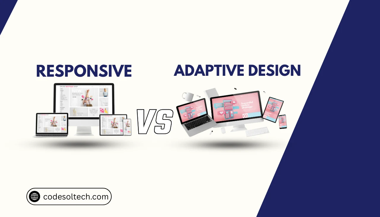
Responsive design is a single-codebase layout strategy in which a web page’s CSS grid, typography, and media elements reflow continuously based on the current viewport width. The browser recalculates element dimensions in real time using fluid percentage-based units and CSS media queries.
Adaptive design delivers 2 to 6 distinct, pre-built HTML/CSS layouts stored server-side. The server or client-side JavaScript detects the device’s screen width and loads a fixed layout template that matches one of the predefined breakpoint classes (e.g., 320 px, 480 px, 768 px, 1024 px, 1280 px, or 1600 px).

Both strategies solve the same foundational problem: rendering a usable interface across the 3 primary device classes — mobile, tablet, and desktop — that account for over 99% of global web traffic as of 2025.
Key Distinction: Responsive design = 1 fluid layout that scales. Adaptive design = N fixed layouts that switch. The choice between them dictates crawl budget consumption, render performance, and Core Web Vitals scores.
2. The Viewport: The Control Surface for Both Approaches
The viewport is the visible display area of a web page within a browser window. It is not identical to the device’s physical screen resolution. A desktop monitor with a 2560 × 1440 hardware resolution operates with a CSS viewport of 1280 × 720 at 2× device pixel ratio (DPR), a configuration defined by window.devicePixelRatio in the browser API.

The Viewport Meta Tag
The viewport meta tag controls how a browser scales the layout canvas. Its absence causes mobile browsers to render a page at a virtual width of 980 px, then scale it down — a behavior that directly triggers Google’s mobile-unfriendly classification and suppresses search rankings.
<!-- Required viewport declaration for mobile-first rendering -->
<meta name="viewport" content="width=device-width, initial-scale=1.0">
The directive width=device-width sets the viewport width equal to the device’s logical pixel width. The directive initial-scale=1.0 prevents browser zoom at load. Both directives are mandatory for Google’s mobile-first indexing to evaluate the page correctly.
Viewport Units in Responsive vs. Adaptive Layouts
Responsive layouts use viewport-relative CSS units — vw (1% of viewport width), vh (1% of viewport height), vmin, and vmax — to create fluid proportional scaling. Adaptive layouts ignore these units and assign hard pixel values (px) or fixed percentage values within each layout template.
3. Breakpoints: Where the Two Architectures Diverge
A breakpoint is a defined viewport width threshold at which a layout changes its visual structure. In responsive design, breakpoints are CSS media query conditions that apply style overrides to an already-fluid grid. In adaptive design, breakpoints are server-side or JavaScript decision points that load an entirely different HTML template.

CSS Media Query Breakpoints (Responsive)
The responsive approach defines breakpoints as ranges using @media rules. The stylesheet contains 1 set of HTML elements whose dimensions are overridden progressively as viewport width increases or decreases.
/* Mobile-First breakpoint cascade */
.container {
  width: 100%;       /* Base: full-width on mobile */
  padding: 0 1rem;
}

@media (min-width: 768px) {
  .container { max-width: 720px; margin: 0 auto; }
}

@media (min-width: 1024px) {
  .container { max-width: 960px; }
}

@media (min-width: 1280px) {
  .container { max-width: 1200px; }
}
Server-Side Layout Switching (Adaptive)
Adaptive systems detect the User-Agent header or use JavaScript’s window.innerWidth to select from a predefined set of layout classes. Major adaptive frameworks define 6 standard layout slots:
- 320 px — Small feature phones and low-end Android devices
- 480 px — Standard smartphone portrait orientation
- 768 px — Tablet portrait orientation (iPad base resolution)
- 1024 px — Tablet landscape and small laptops
- 1280 px — Standard desktop viewport
- 1600 px — Wide desktop and ultrawide monitors
Between two adjacent breakpoint classes, an adaptive layout does not reflow. Elements maintain fixed widths, which produces horizontal overflow or dead whitespace on devices whose viewport width falls between defined breakpoint slots.
Breakpoint SEO Impact: Google’s Googlebot renders pages using a viewport of 412 × 823 px (Pixel 5 logical resolution). A responsive layout renders correctly at this exact width. An adaptive layout only renders correctly if a 412 px breakpoint slot exists — most adaptive systems skip this slot.
4. Mobile-First: A Design Philosophy and an Indexing Requirement
Mobile-first design is the practice of writing CSS rules for the smallest viewport first, then adding complexity for larger screens using min-width media queries. Google adopted mobile-first indexing for 100% of crawled URLs in July 2024, meaning Googlebot evaluates the mobile version of a page as the canonical version for ranking.

Mobile-First in Responsive Architecture
Responsive design natively supports mobile-first implementation. The base stylesheet targets the smallest viewport (320 px to 375 px), and progressive enhancement layers apply to larger breakpoints. This architecture reduces CSS specificity conflicts and delivers the smallest initial CSS payload to mobile devices.
A mobile-first responsive page loads 1 HTML document, 1 CSS file, and 1 JavaScript bundle across all device classes. The total number of HTTP requests stays constant regardless of the user’s device — a performance characteristic that improves Google’s Time to First Byte (TTFB) metric.
Mobile-First in Adaptive Architecture
Adaptive design implements mobile-first by creating the 320 px template first and designing upward. However, each device class loads its own template, which means the 1024 px desktop layout contains CSS and JavaScript not needed by mobile users — dead weight the browser must still parse if the template-detection logic fails.
Adaptive systems require 4 to 6 separate QA testing cycles per design update because each layout template is an independent codebase. Responsive design requires 1 QA cycle per update.
5. Responsive vs. Adaptive Design: Technical Comparison
| Dimension | Responsive Design | Adaptive Design |
|---|---|---|
| Layout Count | 1 fluid layout | 2–6 fixed templates |
| Viewport Handling | Continuous reflow via CSS fluid units | Snap-to-template at defined breakpoints |
| Breakpoint Type | CSS @media style override | Server/JS template selector |
| Mobile-First Support | Native — base styles target 320 px | Manual — requires separate template |
| HTTP Requests | Constant across all devices | Varies by template; can increase on mobile |
| Google Crawl Budget | 1 URL = 1 crawl | Multiple URLs possible = higher crawl cost |
| Core Web Vitals: LCP | Faster — single optimized CSS delivery | Slower — template-switch latency adds 50–200 ms |
| Development Cost | Lower — 1 codebase | Higher — N codebases to maintain |
| Content Parity | Guaranteed — 1 HTML source | Risk of content mismatch across templates |
| Best Use Case | Content-first sites, blogs, e-commerce | High-performance apps needing device-specific UX |
6. SEO Implications: Core Web Vitals and Crawl Budget
Google’s ranking algorithm incorporates 3 Core Web Vitals as direct ranking signals: Largest Contentful Paint (LCP), Interaction to Next Paint (INP), and Cumulative Layout Shift (CLS). Responsive design produces consistently better CLS scores because layout dimensions are pre-calculated by the browser’s CSS engine before the first paint.
Adaptive design introduces CLS risk when the template-detection JavaScript executes after the initial render and shifts elements to fit the loaded template.

Responsive design uses a single URL structure (https://example.com/page) for all devices. Adaptive design sometimes deploys separate subdomains (e.g., m.example.com) for mobile templates.
A subdomain architecture splits PageRank, requires rel="canonical" cross-device tags, and increases Google’s crawl budget consumption by a factor of 2 to 6, depending on the number of active device subdomains.
Cumulative Layout Shift (CLS) in Adaptive Systems
Adaptive layout switching that occurs client-side after DOM load generates CLS scores above the Google-recommended threshold of 0.1. A CLS score above 0.25 classifies a page as “Poor” in Google Search Console and triggers ranking demotion in the Page Experience signal. Responsive layouts that pre-define element dimensions in CSS achieve CLS scores below 0.05 consistently.
Image Handling and Viewport-Aware Loading
Responsive design uses the <picture> element and the srcset attribute to serve viewport-appropriate image resolutions. The browser selects the correct image file based on the current viewport width and DPR, eliminating the need to download a 1920 px image on a 375 px mobile viewport.
srcset="img-480.webp 480w, img-1024.webp 1024w, img-1920.webp 1920w"— defines 3 resolution variantssizes="(max-width: 600px) 100vw, 50vw"— tells the browser the rendered width at each breakpoint- The browser selects and downloads only the matching file, reducing image payload by 40–70% on mobile devices
7. CSS Grid and Flexbox: The Responsive Layout Engines
Modern responsive design uses 2 CSS layout modules as its structural foundation: CSS Grid and CSS Flexbox. CSS Grid manages 2-dimensional layout (rows and columns simultaneously). Flexbox manages 1-dimensional layout (either a row or a column axis).

The auto-fill and auto-fit keywords in CSS Grid create intrinsically responsive column structures that require zero media query breakpoints. A grid defined as grid-template-columns: repeat(auto-fill, minmax(280px, 1fr)) reflows from 1 column to 4 columns as the viewport widens — without a single @media rule.
/* Intrinsically responsive card grid — no media queries needed */
.card-grid {
  display: grid;
  grid-template-columns: repeat(auto-fill, minmax(280px, 1fr));
  gap: 1.5rem;
}

/* Flexbox navigation — wraps automatically on small viewports */
.nav {
  display: flex;
  flex-wrap: wrap;
  gap: 1rem;
}
Adaptive design cannot use these intrinsic sizing techniques because its layout templates are fixed-width containers. The adaptive approach requires hard-coded column counts per template, which increases CSS specificity, maintenance overhead, and the risk of layout regression when breakpoint templates are updated independently.
8. Decision Framework: Choosing the Correct Architecture
The correct architecture depends on 3 primary technical and business variables: content complexity, performance budget, and team size. Neither approach is universally superior — each solves a distinct class of problem.

Choose Responsive Design When:
- The project is a content-driven website (blog, editorial, documentation, or e-commerce catalog)
- A single development team maintains the full codebase
- Google organic search is a primary traffic acquisition channel
- Core Web Vitals optimization is a defined project requirement
- Page content is identical across mobile and desktop users
- The deployment timeline requires a single QA cycle per release
Choose Adaptive Design When:
- Mobile and desktop users require fundamentally different feature sets (e.g., a desktop-only data visualization tool)
- The application targets a controlled device environment (e.g., a kiosk or point-of-sale terminal)
- The engineering team has the capacity to maintain and test 4–6 independent layout templates
- Server-side rendering (SSR) is already in use and device detection adds negligible infrastructure cost
- Legacy browser compatibility for devices that cannot parse modern CSS (Flexbox/Grid) is required
Google’s official developer documentation recommends responsive design as the preferred implementation for mobile web. Google’s own web properties — Search, Gmail, and Google Maps — use responsive design as the primary layout strategy.
9. Performance Architecture: TTFB, LCP, and Render Blocking
Time to First Byte (TTFB) measures the latency between the browser’s HTTP request and the first byte of the server response. Adaptive design increases TTFB by 30–150 ms on the first visit because the server must execute device-detection logic before selecting and returning the correct template.

Responsive design returns a single HTML document without server-side conditional logic, producing TTFB values 40–120 ms lower than equivalent adaptive implementations.
Largest Contentful Paint (LCP) measures the render time of the largest visible content block — typically the hero image or the above-the-fold heading. Google’s LCP threshold classifies scores below 2.5 seconds as “Good.”
Responsive designs achieve this threshold more consistently because they avoid the render-blocking JavaScript required by client-side adaptive template selectors.
CSS media queries are not render-blocking. The browser downloads all CSS files but applies only the rules matching the current viewport. Adaptive JavaScript template selectors execute synchronously in the <head> of the document by default, adding 50–200 ms of render-blocking execution to the critical path.
Final Words
Responsive design is the architecturally superior choice for SEO-critical, content-driven web projects in 2025. It produces better Core Web Vitals, consumes lower crawl budget, and eliminates content parity risk across device classes.

Adaptive design solves a genuine engineering problem — device-specific feature delivery — but introduces URL structure, template maintenance, and render performance costs that directly harm organic search performance.
The decision is not stylistic. It is a structural choice with measurable consequences on TTFB, CLS, LCP, and Google’s mobile-first crawl evaluation.
Ready to audit your site’s layout architecture? Identify the breakpoint gaps hurting your Core Web Vitals scores and get a full mobile-first readiness report today.