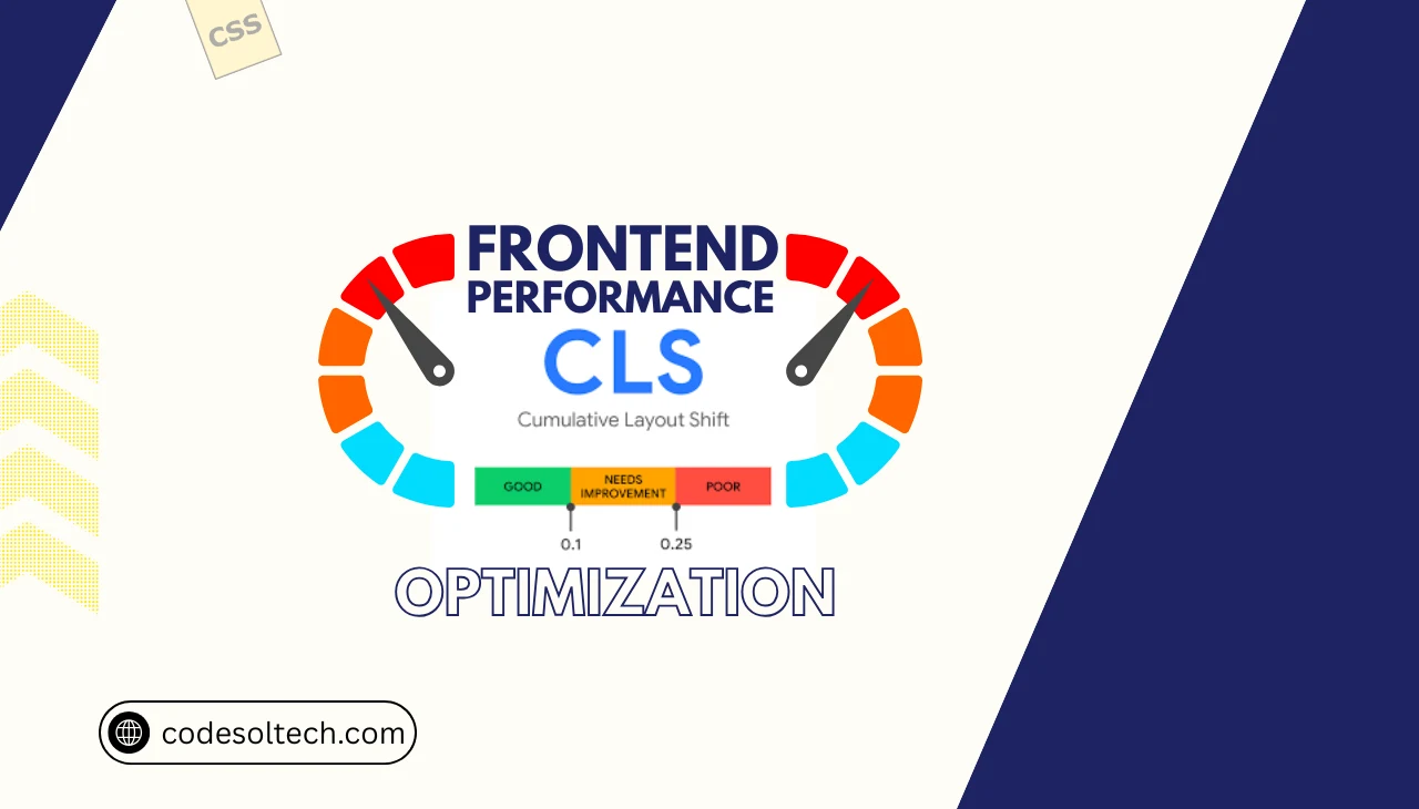
Cumulative Layout Shift (CLS) is a Core Web Vitals metric that measures the total sum of all unexpected layout shift scores occurring during the lifespan of a page. Google defines a good CLS score as 0.1 or less, a score requiring improvement as between 0.1 and 0.25, and a poor score as anything above 0.25. CLS is calculated using the formula:
Layout Shift Score = Impact Fraction × Distance Fraction.
A layout shift occurs when a visible element changes its start position between two rendered frames without user initiation. CLS directly affects user experience, conversion rates, and Google’s page ranking signals under the Page Experience algorithm.
Why CLS Is a Critical Core Web Vitals Signal
Core Web Vitals consists of 3 metrics: Largest Contentful Paint (LCP), Interaction to Next Paint (INP), and Cumulative Layout Shift (CLS). Each metric maps to a distinct dimension of user experience: loading, interactivity, and visual stability, respectively. CLS measures visual stability exclusively.
 to Zero 1")
Google uses Core Web Vitals data collected from the Chrome User Experience Report (CrUX) as a confirmed ranking factor. Pages with a CLS score above 0.25 receive a “Poor” classification in Google Search Console, which signals algorithmic demotion risk.
Field data from CrUX supersedes lab data from Lighthouse when Google evaluates real-world page experience.
How CLS Is Measured: Lab vs. Field Data
CLS measurement operates across 2 distinct data environments:
- Lab Data Tools: Google Lighthouse, WebPageTest, Chrome DevTools Performance Panel
- Field Data Tools: Chrome User Experience Report (CrUX), Google Search Console Core Web Vitals Report, PageSpeed Insights (field section)
 to Zero 2")
Lab tools simulate CLS under controlled conditions and measure total CLS across the full page load. Field tools aggregate CLS from real users and measure session window CLS, which captures the worst burst of layout shifts within any 5-second session window. Google’s ranking algorithm uses field data (session window CLS), not lab data.
The 7 Root Causes of High CLS Scores
CLS originates from 7 primary technical failure points in the frontend architecture:
 to Zero 3")
- Images without explicit width and height attributes — The browser cannot reserve layout space before the image loads, causing reflow.
- Ads, embeds, and iframes without reserved dimensions — Dynamically injected ad containers collapse and expand, triggering shift events.
- Web fonts causing FOUT (Flash of Unstyled Text) — Font swap events alter character metrics, shifting surrounding text blocks.
- Dynamically injected content above existing content — Banners, cookie notices, and pop-ups inserted at the top of the viewport push existing DOM elements downward.
- Animations using CSS properties that trigger layout — Animating
top,left,margin, orwidthforces browser reflow and generates layout shifts. - Lazy-loaded images without placeholder dimensions — Images rendered without aspect-ratio containers collapse before load, then expand on arrival.
- Third-party scripts rendering DOM elements — Chat widgets, social embeds, and tracking pixels inject elements asynchronously, shifting content unpredictably.
Technique 1: Reserve Space for Images and Media
The browser rendering pipeline requires explicit dimensional data to allocate layout space before assets download. Adding width height attributes directly to <img> elements enables the browser to compute the correct aspect ratio during the HTML parsing phase. This technique eliminates image-induced layout shifts at the source.
 to Zero 4")
<!-- CLS-causing pattern -->
<img src="hero.jpg" alt="Hero Image">

<!-- CLS-eliminating pattern -->
<img src="hero.jpg" alt="Hero Image" width="1200" height="630">
Modern browsers use the width and height attributes combined with the CSS aspect-ratio property to reserve space automatically. This mechanism is natively supported in Chrome 79+, Firefox 71+, and Safari 14+. Responsive images using srcset and sizes attributes must also carry explicit width and height values to trigger this behavior.
Technique 2: Define Aspect-Ratio Containers for Embeds and Ads
Ad networks and embed providers inject content with variable dimensions at runtime. Frontend engineers implement aspect-ratio placeholder containers in CSS to pre-allocate the exact pixel space the injected content will occupy.
 to Zero 5")
/* Aspect-ratio container for 16:9 video or ad unit */
.ad-container {
  width: 100%;
  aspect-ratio: 16 / 9;
  overflow: hidden;
}
The CSS aspect-ratio property is supported in Chrome 88+, Firefox 89+, and Safari 15+. For older browser compatibility, developers implement the padding-top hack: setting padding-top to a percentage equal to (height / width) × 100% on a relatively positioned parent container.
Google’s Ad Manager provides size-mapping APIs that declare ad slot dimensions before auction, enabling pre-allocation of the correct container height.
Technique 3: Eliminate Font-Induced Layout Shift with font-display
Web fonts trigger CLS through 2 swap mechanisms: FOUT (Flash of Unstyled Text), where the fallback font renders first and swaps to the web font on load, and FOIT (Flash of Invisible Text), where text remains invisible until the web font loads.
Both mechanisms alter glyph metrics and shift surrounding layout elements.
 to Zero 6")
The font-display: optional descriptor eliminates font-swap CLS entirely by instructing the browser to use the fallback font permanently if the web font does not load within a very short block period.
For design-critical fonts, font-display: swap combined with size-adjust, ascent-override, descent-override, and line-gap-override CSS descriptors calibrate fallback font metrics to match the web font dimensions precisely.
@font-face {
  font-family: 'PrimaryFont';
  src: url('font.woff2') format('woff2');
  font-display: optional;
  ascent-override: 90%;
  descent-override: 22%;
  line-gap-override: 0%;
}
Preloading critical web fonts using <link rel="preload" as="font"> reduces the font swap window, decreasing the probability of a shift event occurring within the CrUX measurement window.
Technique 4: Avoid Layout-Triggering CSS Animations
The browser rendering pipeline executes in 5 sequential stages: JavaScript → Style → Layout → Paint → Composite. CSS properties that trigger the Layout stage force the browser to recalculate the position and size of all affected elements, generating layout shift scores.
 to Zero 7")
Properties that trigger Layout (avoid for animation):
top,left,right,bottommargin,paddingwidth,heightfont-size,line-height
Properties that trigger Composite only (use for animation):
transform: translateX(),translateY(),scale()opacity
Replacing margin-left animations with transform: translateX() eliminates layout recalculation entirely. The browser executes composite-only animations on the GPU thread, bypassing the Layout and Paint stages completely. This technique reduces CLS to 0 for all animation-driven shift events.
Technique 5: Anchor Dynamic Content Below the Viewport
Dynamically injected content — including cookie consent banners, GDPR notices, newsletter popups, and live chat widgets — generates CLS when inserted above or within the existing document flow.
 to Zero 8")
Frontend engineers anchor dynamic content to fixed viewport positions using position: fixed or position: sticky to remove the element from the normal document flow.
.cookie-banner {
  position: fixed;
  bottom: 0;
  left: 0;
  width: 100%;
  z-index: 9999;
}
Fixed-position elements do not participate in the document flow, so their insertion does not shift existing content. Google’s CLS algorithm classifies elements that move due to position: fixed insertions as non-shifting, assigning them a Layout Shift Score of 0.
This is a confirmed behavior documented in the W3C Layout Instability API specification.
Technique 6: Implement Skeleton Screens for Dynamic Content
Single Page Applications (SPAs) built with React, Vue, or Angular fetch content asynchronously after the initial render. Asynchronous content injection into the DOM after First Contentful Paint (FCP) generates CLS when no space reservation exists.
Skeleton screens pre-allocate the exact dimensional space that dynamic content will occupy upon API response.
 to Zero 9")
A skeleton screen renders placeholder elements with fixed width, height, and border-radius values that match the final content dimensions. CSS animations using background: linear-gradient and animation. On the skeleton element, provide visual loading feedback without generating layout shifts.
Libraries, including react-loading-skeleton and vue-content-loader implement this pattern with configurable dimension APIs.
Technique 7: Audit and Control Third-Party Scripts
Third-party scripts are the primary source of uncontrolled CLS in production environments. Scripts from 4 categories generate the highest CLS impact:
- Ad networks (Google AdSense, Media.net) — inject variable-height ad containers
- Social embeds (Twitter/X, Instagram, TikTok) — load iframes with dynamic content height
- Live chat widgets (Intercom, Zendesk) — inject fixed launcher buttons and chat windows
- A/B testing platforms (Optimizely, VWO) — modify DOM elements before user interaction
 to Zero 10")
Frontend engineers audit third-party CLS contribution using Chrome DevTools Performance Panel. The Layout Shift Regions feature in DevTools highlights shifting elements in blue on the rendered page. WebPageTest’s filmstrip view isolates the exact video frame at which each layout shift occurs, identifying the initiating script.
Tag Manager implementations must enforce async and defer loading for all third-party scripts to prevent render-blocking and synchronous DOM manipulation.
How LCP and CLS Interact in Core Web Vitals Scoring
Largest Contentful Paint (LCP) and CLS measure 2 distinct performance dimensions but share a dependency on image and font loading behavior. An unoptimized LCP element — typically a hero image or above-the-fold heading — that loads without reserved dimensions degrades both LCP and CLS simultaneously.
 to Zero 11")
Preloading the LCP image using <link rel="preload" as="image"> in the <head> accelerates LCP while reducing the duration of the layout shift window. Serving images in WebP or AVIF format at correct intrinsic dimensions reduces file size, accelerating download, and minimizing the shift risk window.
Google’s PageSpeed Insights report displays LCP and CLS scores on the same diagnostic interface, enabling engineers to identify and prioritize overlapping optimizations.
Measuring CLS Improvements: The Web Vitals JavaScript API
Frontend engineers measure CLS programmatically using the Layout Instability API, available in all Chromium-based browsers. The web-vitals JavaScript library published by Google abstracts the raw PerformanceObserver API into a single function call.
import { onCLS } from 'web-vitals';

onCLS((metric) => {
  console.log('CLS Score:', metric.value);
  console.log('Entries:', metric.entries);
  sendToAnalytics(metric);
});
 to Zero 12")
The metric.entries array exposes individual LayoutShift entries, each containing startTime, value, hadRecentInput, and sources properties. The sources property identifies the specific DOM elements responsible for each shift event, providing element-level diagnostic data.
Engineers integrate this data pipeline into Google Analytics 4, BigQuery, or custom observability platforms to monitor CLS trends in real user traffic over time.
CLS Benchmarks by Industry Vertical
CrUX data published in the Web Almanac 2023 establishes CLS performance baselines across 4 industry verticals:
| Industry | Median CLS (Mobile) | % Passing “Good” Threshold |
|---|---|---|
| E-commerce | 0.14 | 58% |
| News & Media | 0.19 | 41% |
| Technology | 0.08 | 74% |
| Healthcare | 0.11 | 62% |
News and media sites record the highest CLS scores due to above-the-fold ad injection, sticky navigation elements, and late-loading article body content. E-commerce sites generate CLS primarily from product image carousels and dynamically rendered promotional banners.
Technology sites achieve the lowest median CLS due to simpler DOM structures and lower third-party script density.
Final Words
CLS is a binary ranking signal that pages either pass the 0.1 threshold or fail it. The 7 techniques documented here dimensional reservation, aspect-ratio containers, font metric overrides, composite animations, fixed-position anchoring, skeleton screens, and third-party script control, address every root cause of layout instability.
Implement them systematically, measure with real user data, and achieve a sustained CLS score of 0.
→ Start your CLS audit today using Chrome DevTools Layout Shift Regions and the web-vitals npm package. Identify your top 3 shifting elements within 15 minutes and eliminate them using the techniques in this guide.